A shelf, two books standing, one leaning.
Everything you need to show Toread the way it shows itself: the mark, the wordmark, the colours, the type and the backgrounds. Use them as they are. If you need something that is not here, ask before inventing it.

The mark
Solid geometry on a 32-unit grid so it survives 16px. The lean is the only diagonal in the system; it is what makes the mark read as a hand rather than a generator.






Wordmark and lockups
Literata SemiBold, capital T, tracked to −0.03em. Inter is never used for the name: the shell is gray and the brand is the one serif thing in it.
Colour
Mineral: limestone, weathered slate, oxidised copper. The chrome is gray; verdigris is spent once per surface. Click a swatch to copy it.
Type
Inter for the shell, Literata for the page, JetBrains Mono for values. Three weights, sentence case everywhere.
Backgrounds
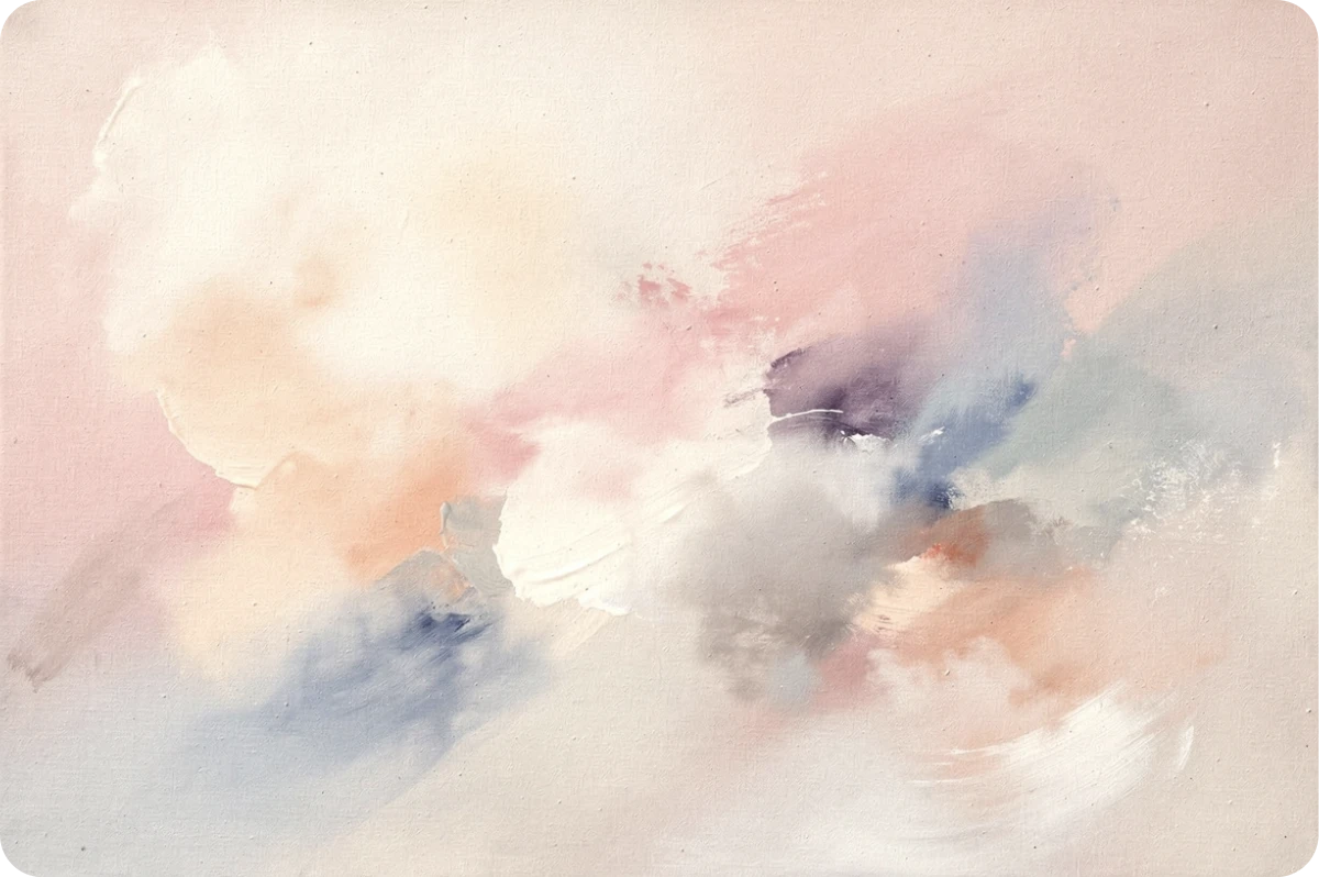
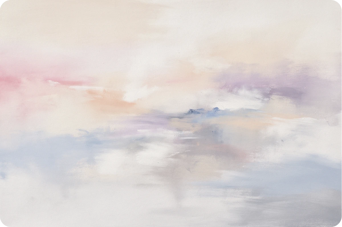
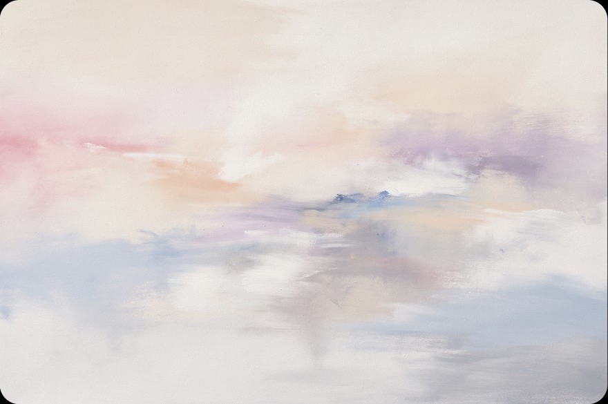
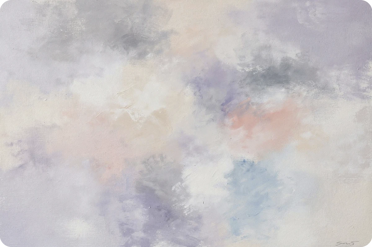
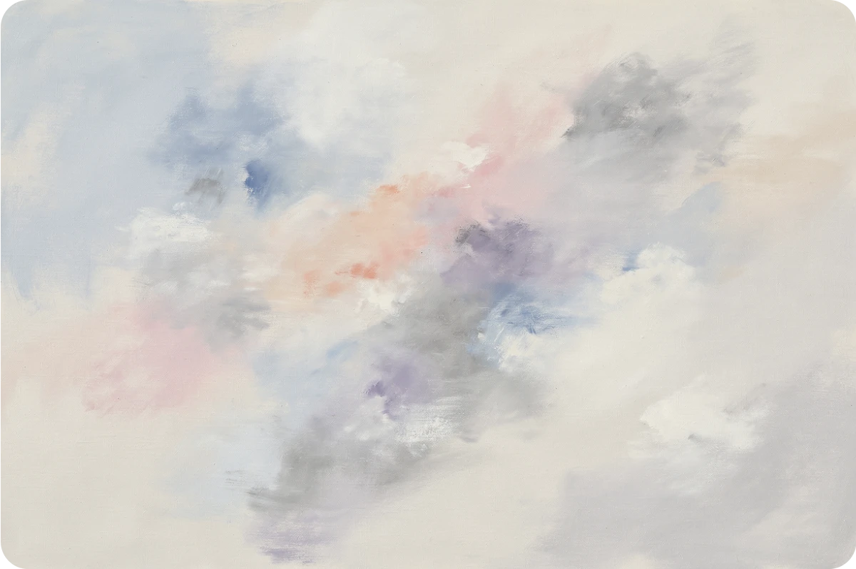
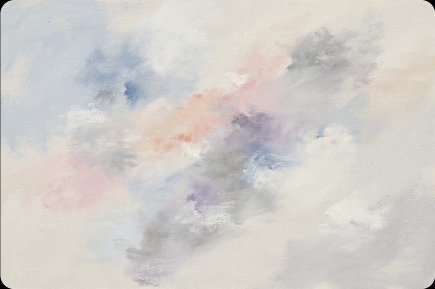
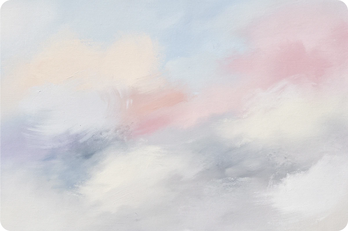
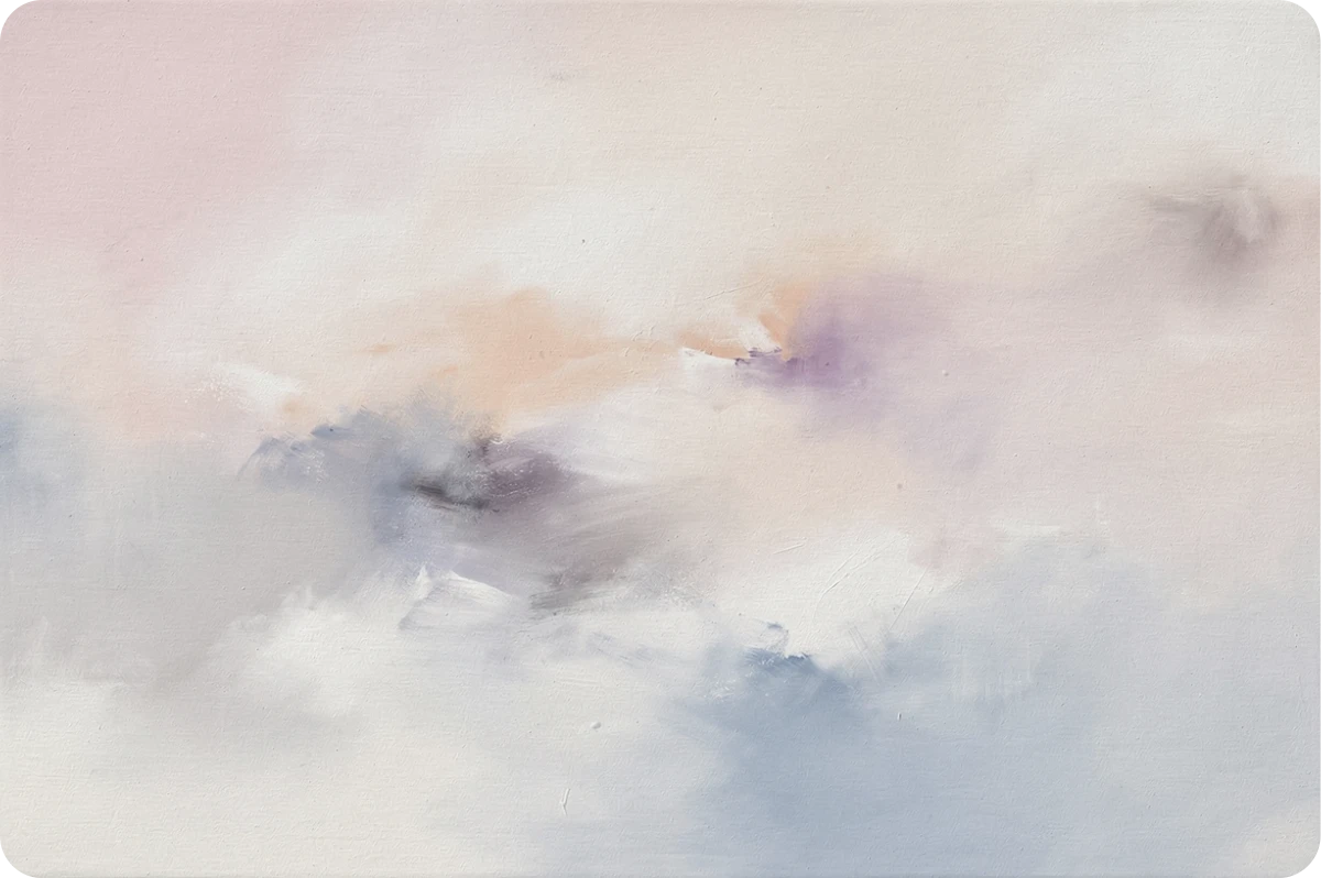
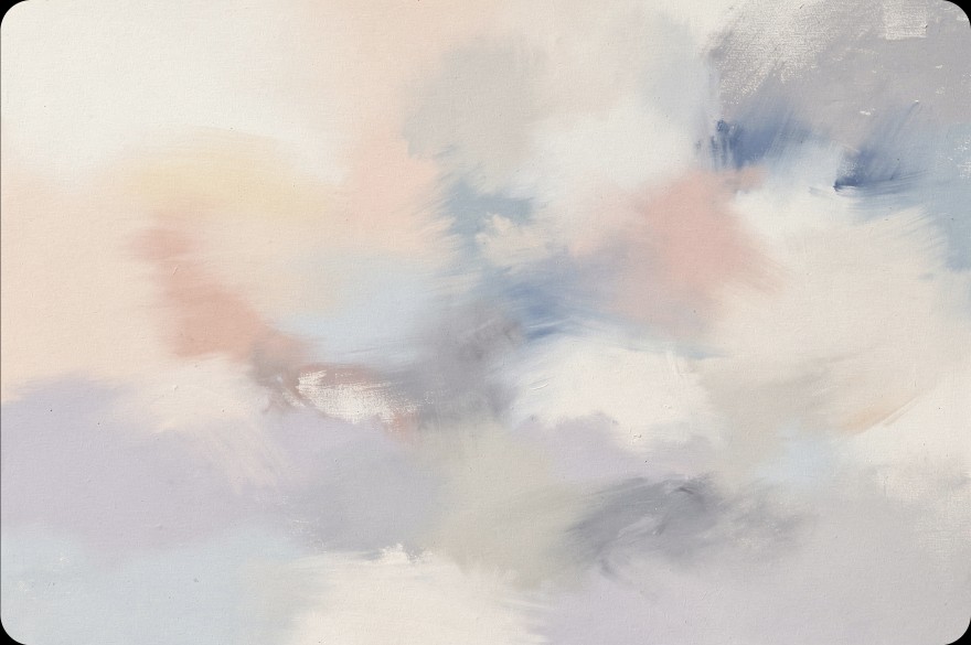
Ten hand-painted washes for posts that arrive without an image. An item always gets the same one, chosen by hashing its id. Never put text on top.
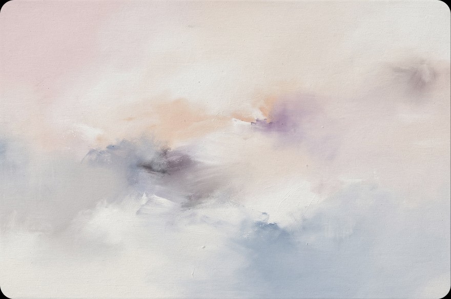
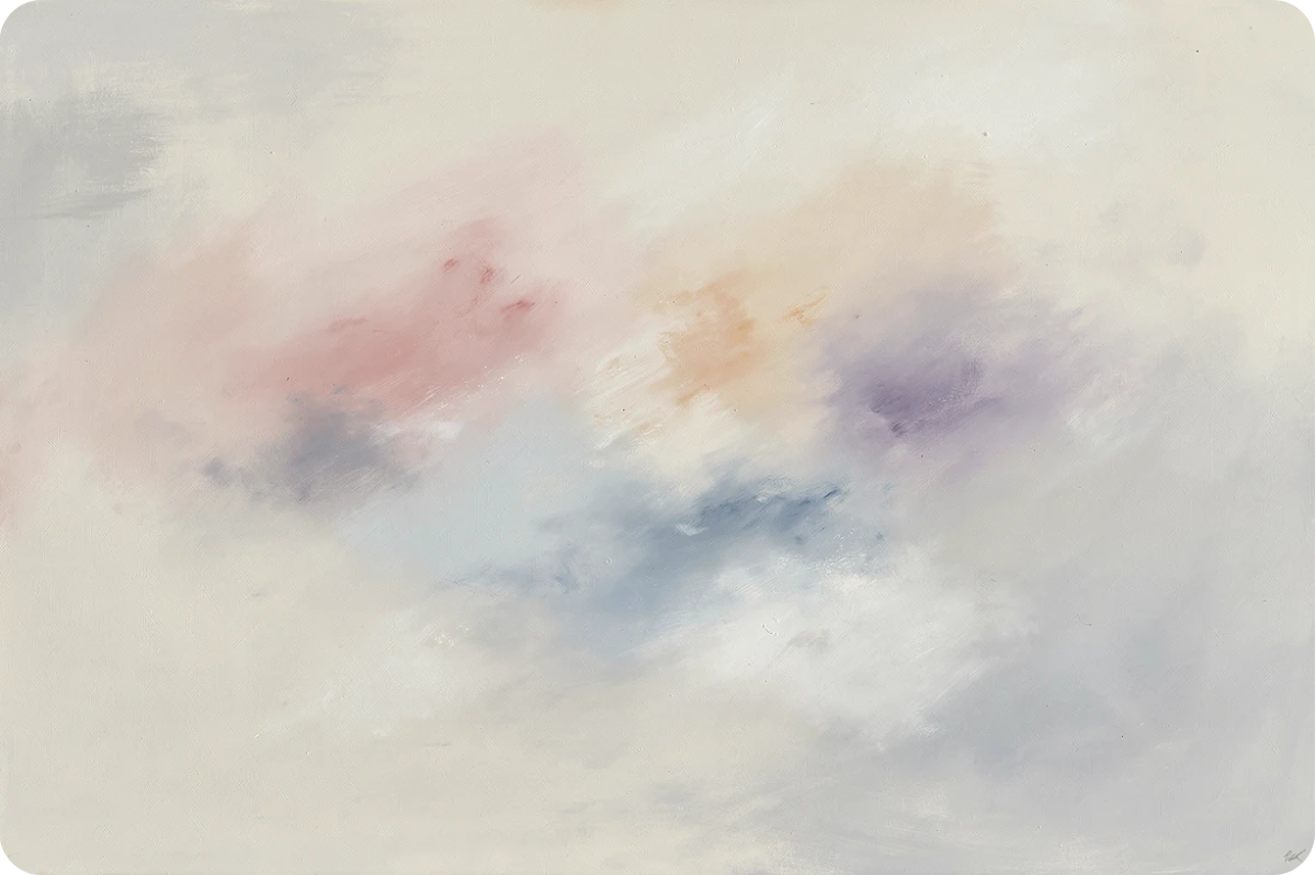
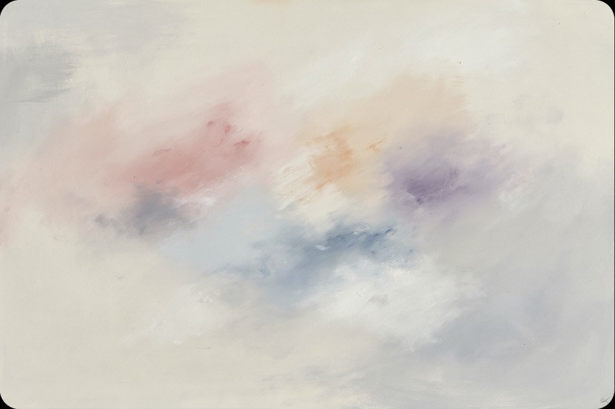
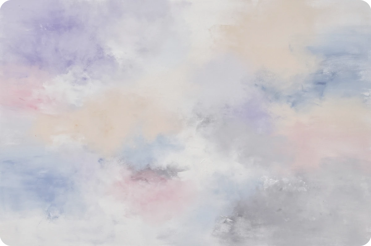
Link previews
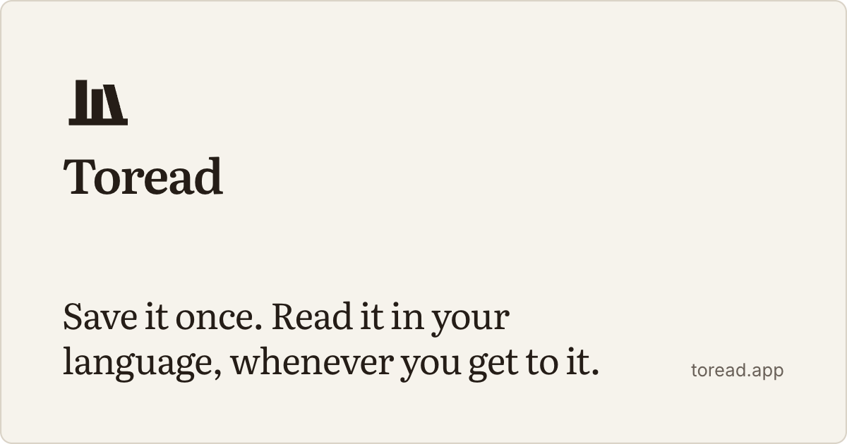
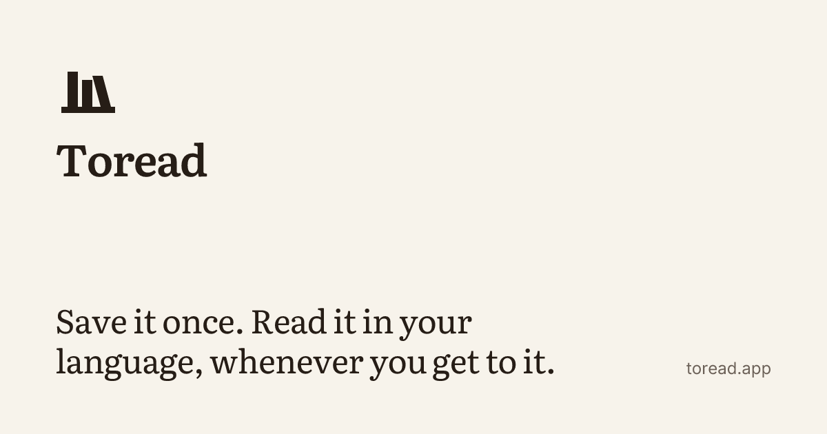
Every page ships a 1200×630 card rendered on the edge from the same template: the site card here, and one per saved item at /og/:id.png.
Using the mark
- Keep the mark mono
- Ink on white, white on ink, paper ink on paper. The whole mark is never green.
- One green per surface
- Verdigris goes on the leaning volume of the app icon and on the language line of a card. Nowhere else.
- Clear space is one volume
- Five thirty-seconds of the mark's width on every side, measured from the shelf rule.
- Never outline, stretch or tint
- No strokes, no non-uniform scaling, no mark on a green tint.
- Mark alone below 120px
- The lockup needs 120px of width; under that, the mark carries the name.
- Nothing on top of a wash
- Washes fill a thumbnail slot. Titles sit beside or below them, never over them.
Voice
A librarian's, not a coach's. It names what happened, offers one next thing, and gets out of the way of the text.